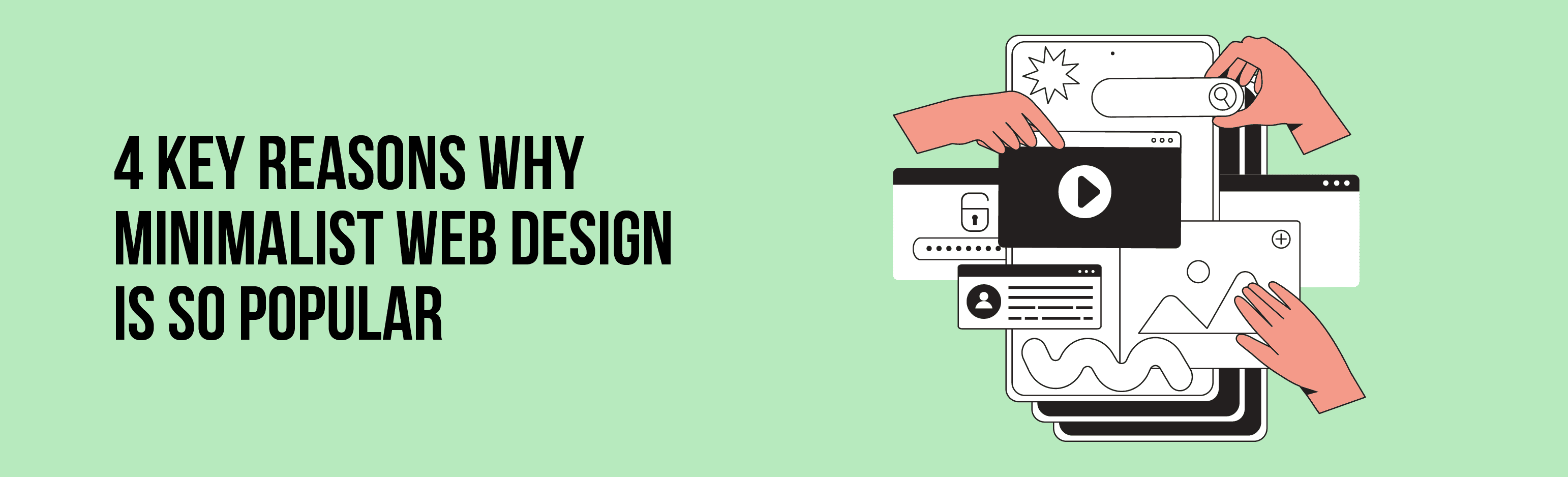
4 key reasons why minimalist web design is so popular

If you’re old enough to remember what the early internet was like, it’s not hard to notice that it’s completely unrecognisable from its initial appearance a few decades ago. Gone are the flashy graphics and blocky screeds of text – today, the vast majority of websites embrace minimalism as a design principle.
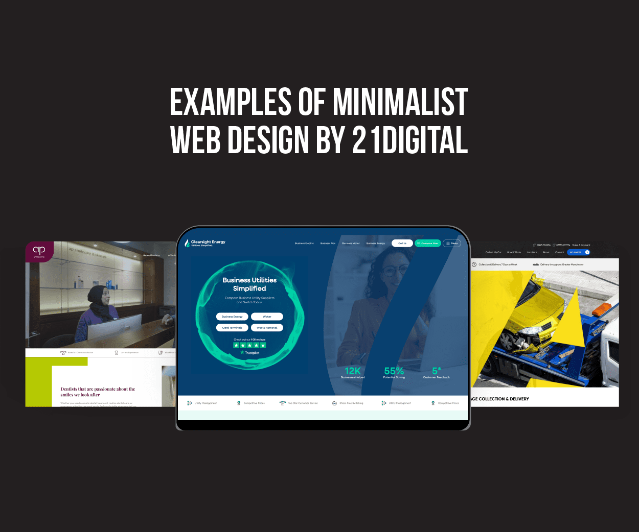
Now, this is about more than just aesthetics. It’s a fundamental shift in the way that websites are created and used. After all, there are plenty of good reasons why we use minimalism as the guiding principle for the sites we design, develop and launch for our customers here at 21Digital. In short, a lot of it comes down to the user experience.
So to expand on that, here are four key reasons why minimalist web design has become the go-to template for the web at large.
Minimalist sites are easier to read and navigate
Minimalist sites are distinguished by their clean, uncluttered interfaces – free from any flashing distractions or bright, clashing colours. (Pink and black was one particularly eye-watering combination from days of yore.) Those clear, simple interfaces help visitors to easily identify where they need to go, which has several positive effects on the overall user experience.
For starters, it reduces the bounce rate from frustrated users leaving after they can’t find what they’re looking for. By the same token, it increases conversion rates from people who are able to easily achieve what they want to do – such as buying something, booking a service, or learning more information.
Boosted speed and performance
Besides the all-important UX (user experience), minimalist designs also bring useful technical and SEO benefits to a site, too. You may have heard of the oft-quoted study by Google that indicates over half of users will “bounce” from a page (in other words, navigate away) if it takes more than three seconds to load. While that study is a few years old now, speed is still a key SEO ranking factor for Google, for the same key reasons – essentially, it matters to users. A slow loading speed can therefore still cost you a lot of web traffic, and therefore business.
That’s where a minimalist design comes in handy. Since by definition it uses fewer design elements, there’s less to load, so minimalist sites tend to be faster. Faster sites, as we’ve touched upon, tend to rank higher in Google Search Engine Results Pages (SERPs) – maximising traffic and revenue for their owners.
Minimalist sites are mobile-first
This is one of those relatively subtle features of the modern internet that reflects a huge and obvious change from the world as it was a few decades ago – namely, that countless people now use their mobile phones far more than they use desktop computers.
As of March 2024, more than 60% of all website traffic comes from mobile, and that’s generally been the status quo for quite some time. For years, any website that wasn’t optimised for mobile was likely to have been costing its owner a huge slice of web traffic (and therefore revenue).
Hence the understandable pivot to today’s minimalist designs. This experience probably sounds familiar – when you’re navigating a website on a smaller screen, even the slightest distraction that gets in your way can impact the experience. Cluttered pages can be exceptionally difficult to navigate, with so many elements competing for limited space, and the chances of users accidentally clicking things (or being unable to find what they need) are quite high. That’s why, again, mobile-first sites are prioritised in Google SERPs – and why minimalist websites provide a better UX for users, and more traffic and revenue for website owners.
Minimalist sites enhance your brand identity
As the saying goes, less is more. The fewer design elements there are on your site, the more memorable they’ll be for your target audience – and so the easier it’ll be to communicate your brand identity. Colour is one excellent example of this. We tend to associate certain feelings with certain colours – blue shades tend to communicate a sense of calm and trust, green is associated with growth, prosperity and the environment, whereas purple and gold can be used to create a sense of luxury.
Here’s where minimalism is important. Too many of these colours jumble their messages – whereas one or two, used strategically, can work wonders to effectively communicate to your customers what you’re all about. And all before you’ve said a word!
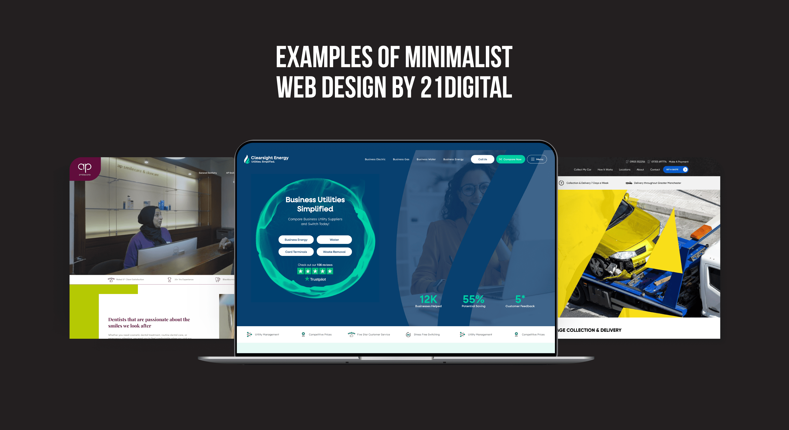
Now, this isn’t an exhaustive list by any means, but it’s an excellent indication of exactly why minimalist websites are here to stay – and why they continue to be a mainstay for our web designers and developers here at 21Digital. And if you’re thinking about a revamp of your own website (or creating a new one entirely) that’s exactly where we can help. With around 20 years of experience to our name, we have a long history of designing and launching sites that serve as key cornerstones for our clients’ digital presences. Feel free to take a look at our case studies to find just a sample of what we’ve achieved for our happy clients. Feel free to contact us on 01254 660 560, and let’s talk!